Analyze list data in Business Central
Content menu
- Dive into list data using Data Analysis Mode
- Get started analyzing list data in Business Central
- Areas of the page in 'Data Analysis Mode'
- Analysis in Pivot mode
- Limitations in list data analysis
Dive into list data using 'Data Analysis Mode'
In Business Central version 22, which was released with Dynamics 365 2023 release wave 1, Microsoft introduces a brand new feature that has excited many BC users. This feature is 'Data Analysis Mode'.
With 'Data analysis mode', data analysts and end users now have the opportunity to analyze list data in Business Central directly from the page in the browser without having to run a report or open the page in another application, such as Excel.
The data analysis mode is a new and far-reaching way to interactively calculate, summarize and review data in Business Central. Rather than running reports with different settings and filters, with 'Data Analysis Mode' you can simply add multiple tabs that represent different tasks or views on your list data. It can be, for example, 'my customers', 'follow up on goods', 'latest added suppliers', 'Sales statistics' or completely other views that may be useful to you.
|
Useful tip
One neat thing about the data analysis mode is that it doesn't change any of the underlying data on the list page itself or on the page layout when not in data analysis mode. So the best way to find out what you can do in data analysis mode is to simply try it out yourself.
|
Get started analyzing list data in Business Central
- First, open the list page in Business Central.
For example, if you want to work with 'receivable items', you must select the magnifying glass icon (Alt+Q), enter 'receivable items'. You then select the associated link. - You switch the 'Analyze' button on or off in the action bar at the top of the page.
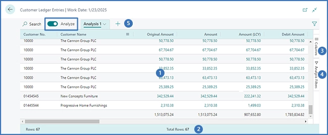
'Data Analysis Mode' opens the data in a completely new user experience designed and optimized for analyzing your data. The familiar action bar you normally know from Business Central when you are in data analysis mode is replaced by a special data analysis mode bar. Below you can see the different areas of the page in 'Data Analysis Mode'. The areas numbered in the picture are explained below.
 - Use the different areas in 'Data Analysis Mode' to manipulate, summarize and analyze your data. See the following sections for details.
- When you are finished and wish to exit the analysis mode, simply disable the 'Analyze' function by turning off the toggle switch.
Analytics tabs you've added are saved until you delete them. This means that if you return to 'Data Analysis Mode' again, they are exactly as when you left Data Analysis Mode.
|
Please note
Data displayed in analysis mode is controlled by the filters or views specified on the list page. This allows you to pre-filter data before entering analysis mode.
|
Areas of the page in 'Data Analysis Mode'
#1 Data area
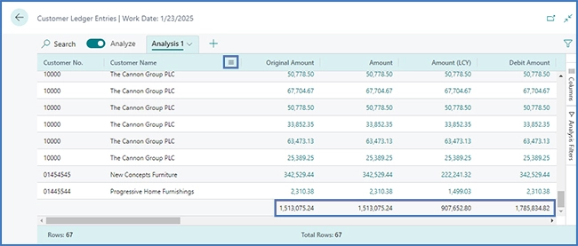
In the data area, the rows and columns of the list page are displayed and this is also where your data is summarized. The data area is flexible, making it easy to control the layout of columns. In addition, it is a quick way to get an overview of your data. Unless you have specified row groups, in the columns where numerical values are included, you will see the sum of all the values in the column in the last row. In the image below, the totals are shown as a subtotal for the groups.

#2 Summary bar
In the summary bar that you will find at the bottom of the page, you will see statistics about the data in the list. As you interact with columns whose values can be summed, for example by selecting multiple rows in a column that shows amounts, your data is updated.

#3 Columns
'Columns' is one of two panes on the right side of the page that work together to define your analysis. The second is the 'Analysis Filters' pane.
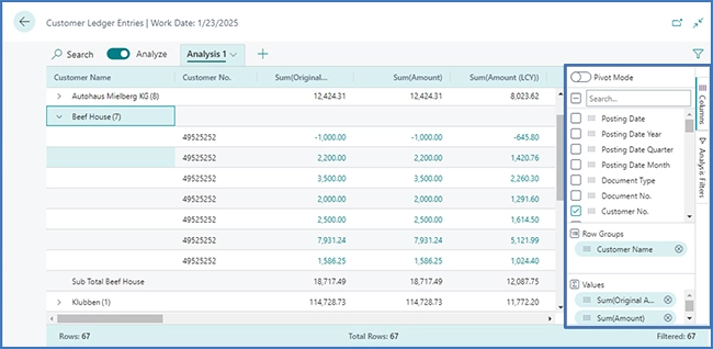
You use 'Columns' to summarize your data. You use the 'Columns' pane to specify the columns you want to be included in your analysis.

#4 Analysis filters
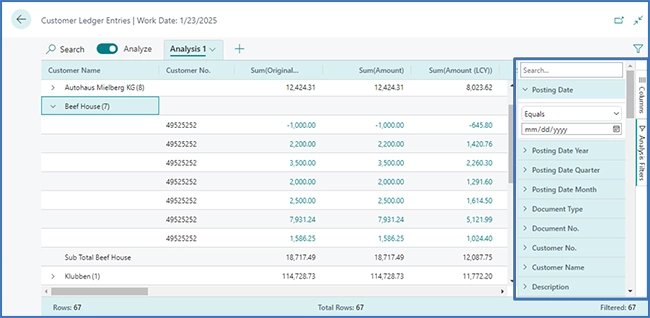
If, in order to limit the entries in the list, you want to specify additional data filters on columns, this is done in the 'Analysis filters' pane. You just need to set filters on the column the entries in the list are limited and then only sum to the entries you are interested in, based on a criterion you define yourself.

For example, let's assume that you are only interested in data for a specific customer or sales order that exceeds a specific amount. In such a case, if you want to specify a filter, simply select the column, select the comparison action from the list (eg 'Equal to' or 'Starts with') and then specify the value.
|
Please note
The additional filters are only used for the current analysis tab. This means you have the ability to define exactly the additional data filters you need for a specific analysis.
|
#5 Tabs
The tabs located in the area at the top of the screen allow you to create different configurations (analysis filters and columns) on separate tabs, where it is possible to work on the tabs independently of each other.
By default, there is at all times at least one tab called Analysis 1. When you want to save analysis configurations you often use on a data set, it is useful to add more tabs. For example, you can have tabs that analyze your data in Pivot mode and other tabs that aim to filter to a subset of rows. Some tabs may also display a detailed view with many columns, while other tabs only display a few key columns.
|
Useful tip
The tabs that you configure are only visible to you and other users will only see the tabs that they have configured.
|
Analysis in Pivot mode
Pivot mode is used if you need to analyze a large amount of numerical data and subtotal data by categories and subcategories. Pivot mode is similar to the pivot tables you may already know from Microsoft Excel.
If you want to activate and deactivate the Pivot mode, simply select the 'Pivot mode' option in the 'Columns' pane (3) on the right. When Pivot mode is activated, the 'Column Labels' area appears in the pane. To group totals for rows into categories, use the 'Column Labels' area. The fields you add to the 'Column labels' area are displayed as columns in the data area (1).
When you build data analysis in pivot mode it involves moving fields into these three areas: 'Values', 'Column Labels' and 'Row Groups'.
|
Useful tip
The columns that only have a few values are best suited to use in the 'Values' column.
|
Limitations in list data analysis
Currently, the analysis is limited to 100,000 rows. If you exceed this limit, a message is displayed that the limit has been exceeded. However, the limitation can be circumvented by specifying filters on the page before switching to data analysis mode. Perhaps you want to analyze a certain grouping of customers, or perhaps you only have data from the current year. There is also the option of choosing a predefined view if it can be used for your analysis.
